Typography ✶ Poster Design ✶ Research
Chinese posters from the 20th century represent some of the most iconic poster imagery in history. Posters were one of the most influential forms of communication during the Chinese Communist Revolution and were extremely effective in their messaging.
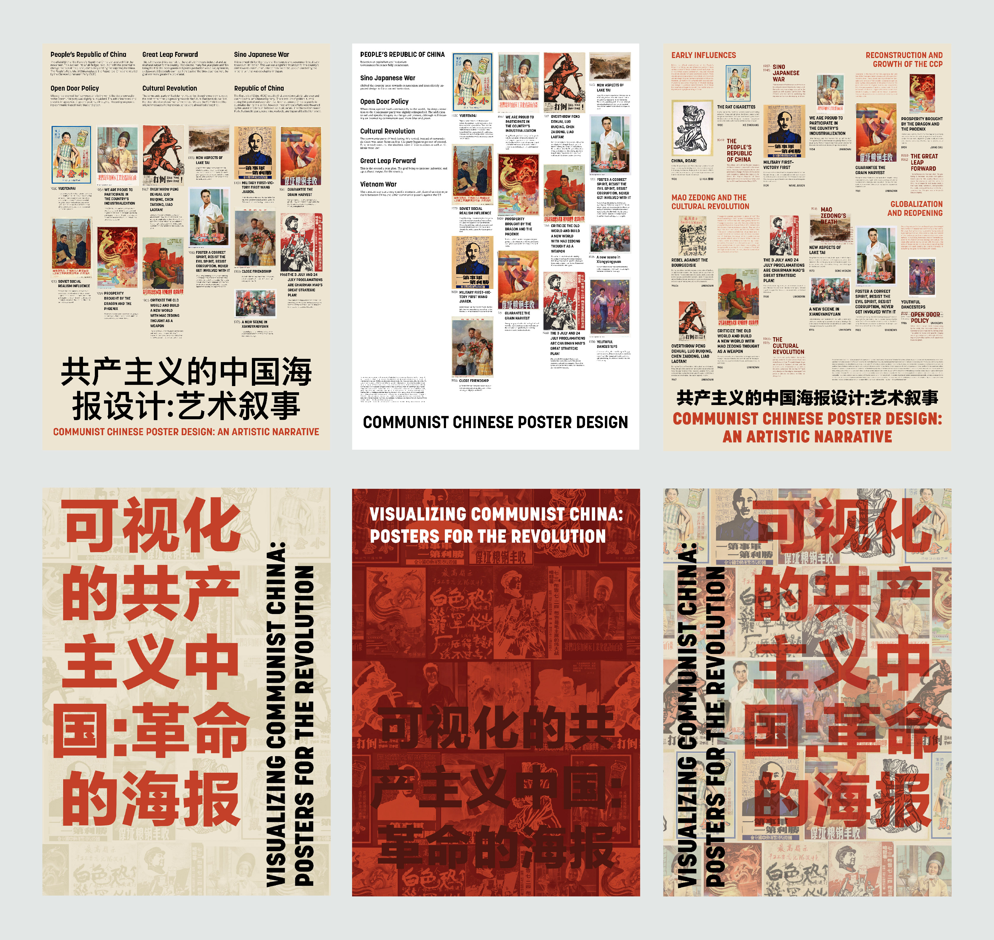
This project highlights how communist posters in China developed and mirrored the country and the evolution of the Chinese Communist Party. The subject and quality of the posters reflect the political atmosphere spanning the 20th century. Rather than focusing on the narrative we're taught in the western world about communism, I presented the information to an American audience through a more Chinese lens.
The prompt for this project was to create a poster that reauthors, reframes, or redirects a timeline, creating a counter-narrative to traditional graphic design history.


Because posters were both the content and inspiration of this project, I knew that I had to make sure that my research was really strong. My main focus while doing research was to find a non-western lens. The purpose of my poster was to create a counternarrative of Chinese communist artwork outside of the anti-communist rhetoric we are taught in the west.
My mom became a really great resource for this project. She was able to provide a lot of context on where to find reliable sources for Chinese history and artwork that were not western sources. I realized very early on that doing research on communist China with the western resources that I typically use was going to be impossible to do without an inherently strong American perspective.
Through my research, I slowly narrowed down the posters I wanted to include as well as the historic context I wanted to provide.
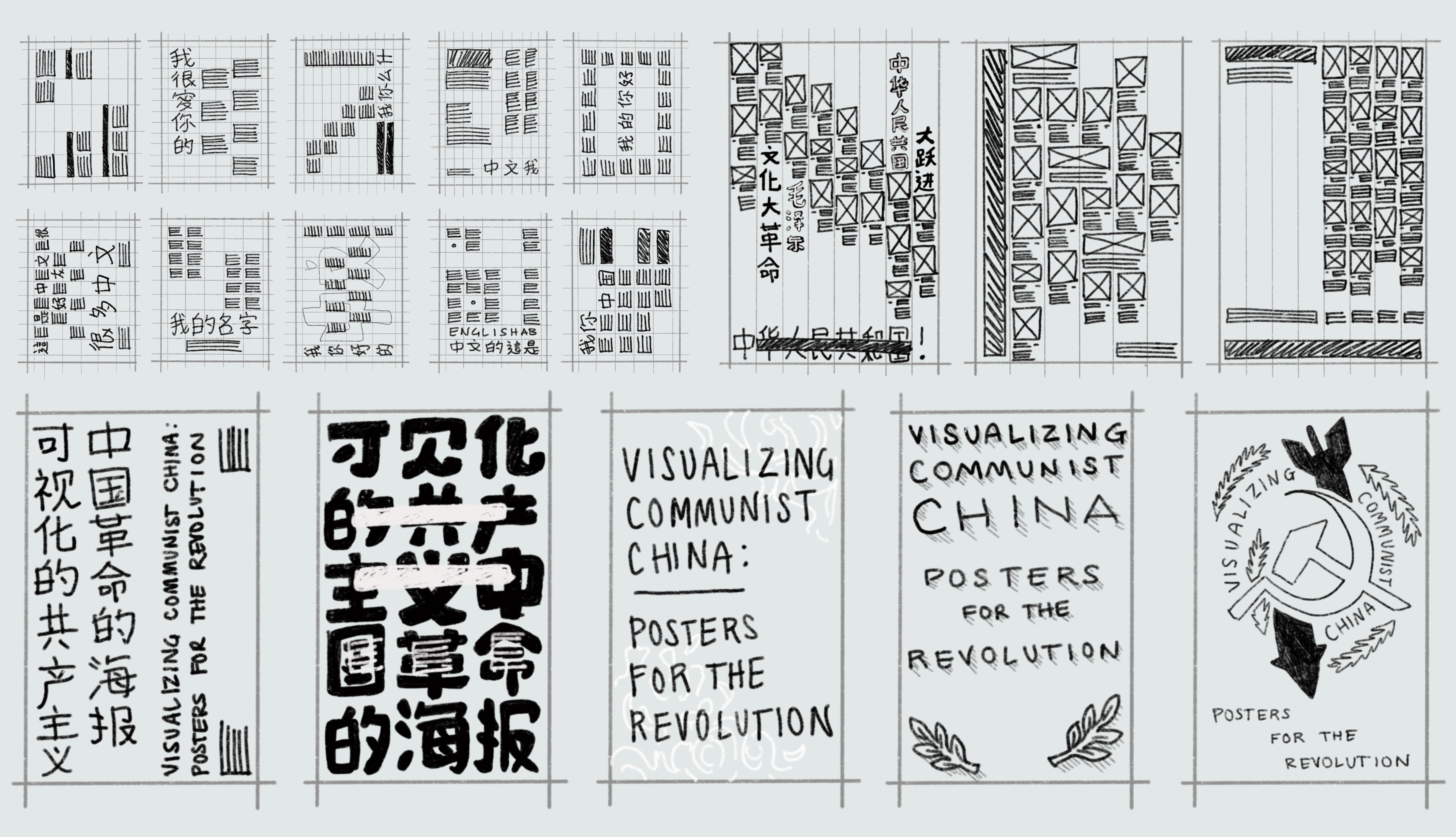
Throughout the process, I was thumbnailing and sketching out ideas for content layout and dynamic typography. My initial sketches focused on using different approaches for margins and the modular grid. I tried to create many different compositions that would lead the viewer's eyes across the poster in varying ways. Chinese characters were also very useful as a form of word as image to break up the content and create a more organic but nonlinear sequence.

Communist posters from the 20th century had a very strong typographic language. I wanted to capture and translate this aesthetic while still adding a modern twist.
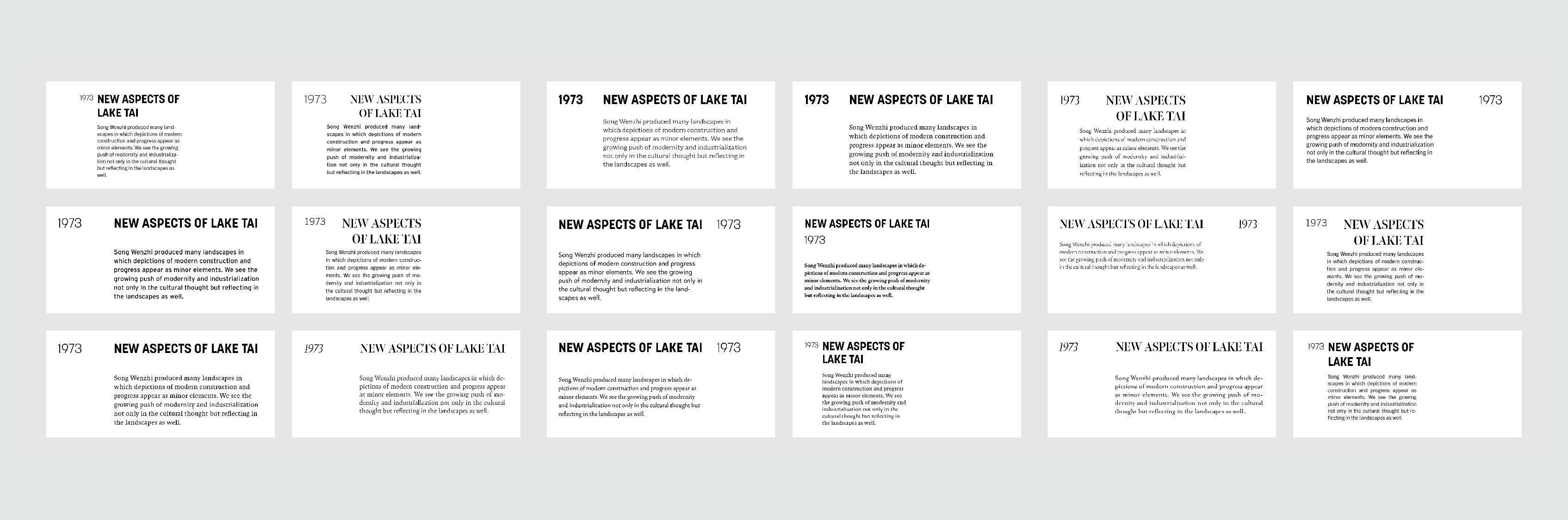
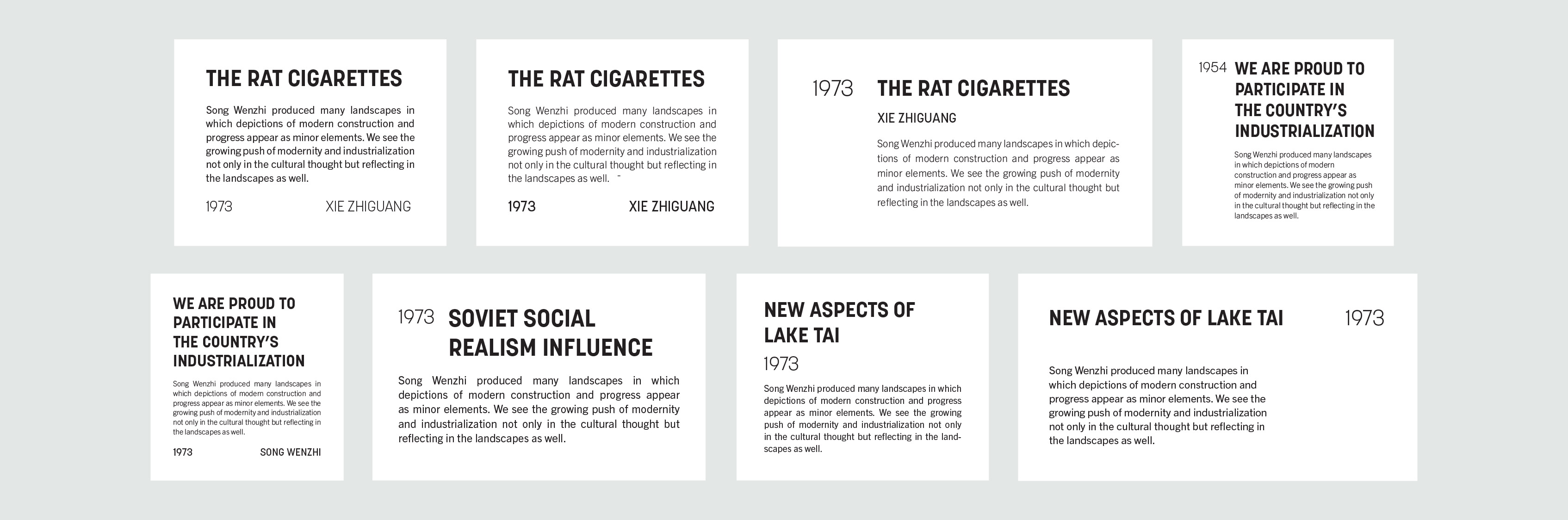
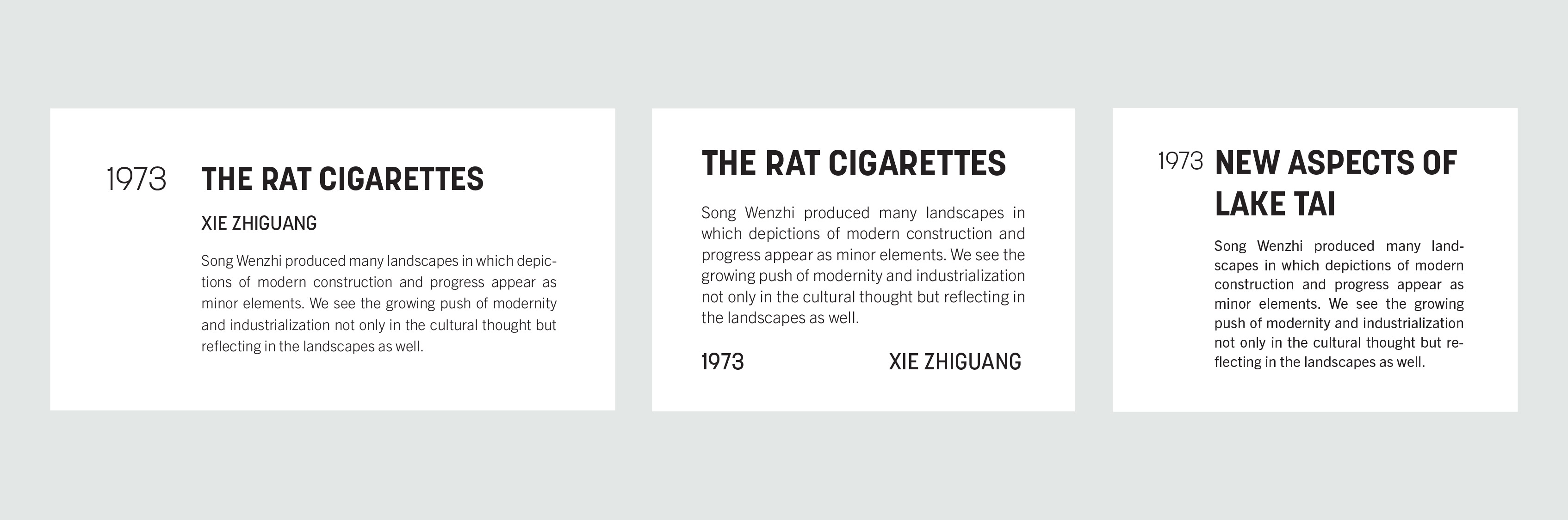
Through my research of posters during this period, I found that most posters used two kinds of typefaces, either heavy, thick sans serifs or very contrasted, classic serif fonts. I explored a wide variety of typefaces in different combinations and lockups.
I decided to use Korolev, which is inspired by a typeface seen in photographs on a poster at the Red Square Parades. The Red Square Parades occurred in the 1930s in Soviet Russia. The longer quality and weight of the typeface illicit imagery from Soviet communist posters which had a significant influence on Chinese communist posters.
With such a strong display font, my goal with Trade Gothic was to complement Korolev. Trade gothic has a similar condensed quality to Korolev. The focus of the Revolution in China was progress through communism, therefore I decided on this modern sans serif.
On the content side, I wanted to create the feeling that the posters were hanging on a wall as they would have in communist China. I knew I wanted to have the title at the bottom to anchor the design in the same way many of the posters from my research did. On the expressive side of the poster, I focused on using type in a dynamic way and complementing the content side.
I experimented with different grid layouts as well as a few of the different type lockups. At this stage, I had a lot of the pieces of the poster (content, lockup, etc.) so I was exploring different ways to combine it all together and finding cohesion between parts.
I experimented with different grid layouts as well as a few of the different type lockups. At this stage, I had a lot of the pieces of the poster (content, lockup, etc.) so I was exploring different ways to combine it all together and finding cohesion between parts.