UX Design ✶ Content Architecture ✶ Web Design
Having a large set of data in the form of an archive, there are so many ways that the information can be displayed. For this project, I focused on designing a website that was intuitive but still interesting to interact with.
I've always loved Studio Ghibli movies from a young age. The stories, artwork, and strong female characters have always inspired me. The prompt for this project was to document any large collection, and with such a large universe of content to work with I felt that Studio Ghibli’s work would be a great fit.
This project is best viewed in Figma, where you can explore all the interactive features, here ︎.
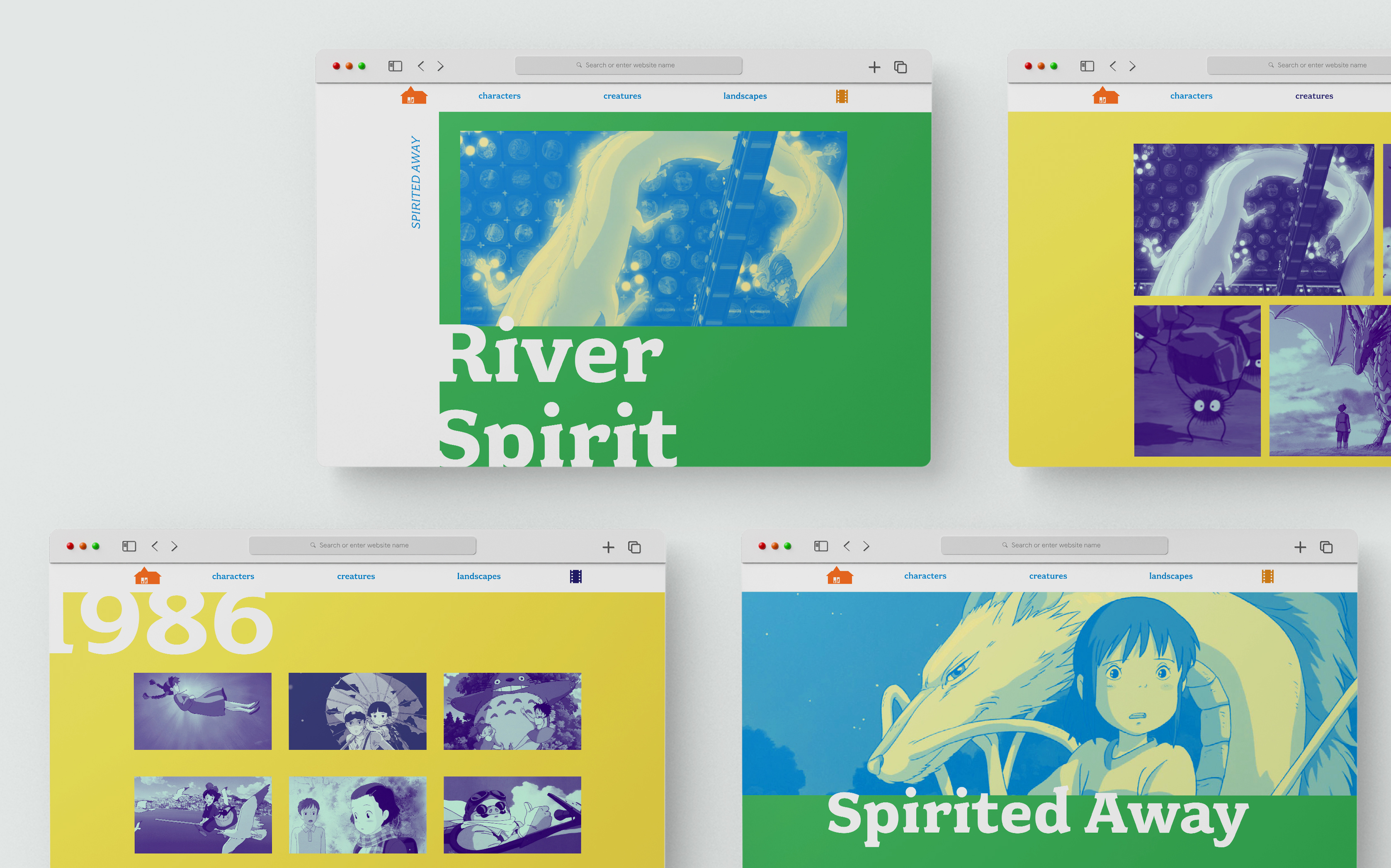
! Please note ! this is an unfinished prototype. Every internal page has not been rendered. As you interact with the Figma prototype you can only interact with content from the world of Spirited Away. As a Figma prototype, not all of the functionality can work perfectly. So please keep that in mind with some of the interactions!

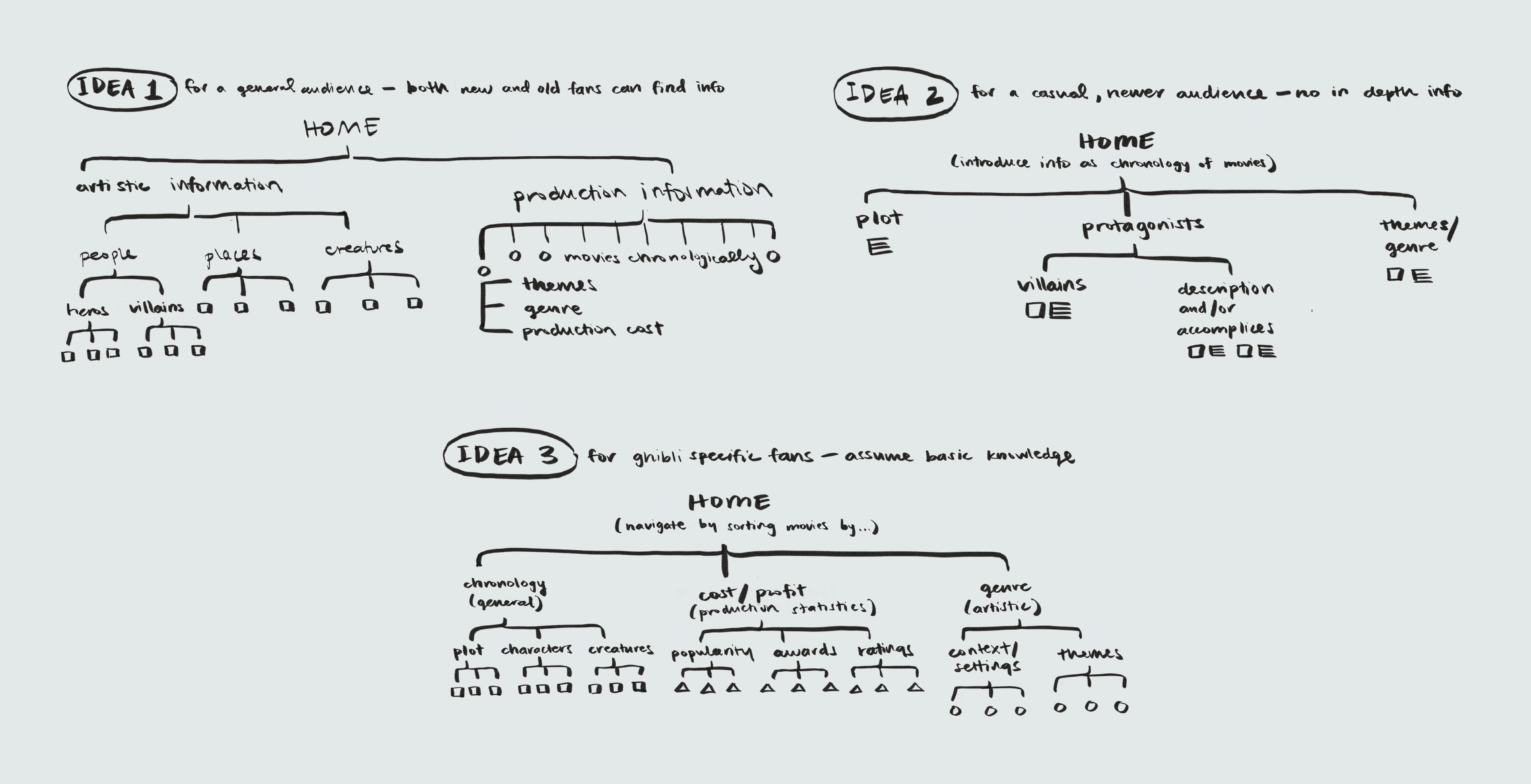

There is a lot of content within the Ghibli universe that I had the potential to use. Most of this information broke down into either information from the real world (profit, ratings, genres, etc.) or from within the universe (characters, places, relationships, etc.). For this first step, I strongly considered, who would this website be for? And what kind of information would they want to access? I decided that since there is a breadth of information and fans for Studio Ghibli, making an archive that people with some base knowledge could explore would make the most sense.
Navigationally, I decided to also have multiple ways that you could access the same information. So users can primarily access information through characters, creatures, and landscapes, as well as secondarily through a chronology of movies.
Navigationally, I decided to also have multiple ways that you could access the same information. So users can primarily access information through characters, creatures, and landscapes, as well as secondarily through a chronology of movies.
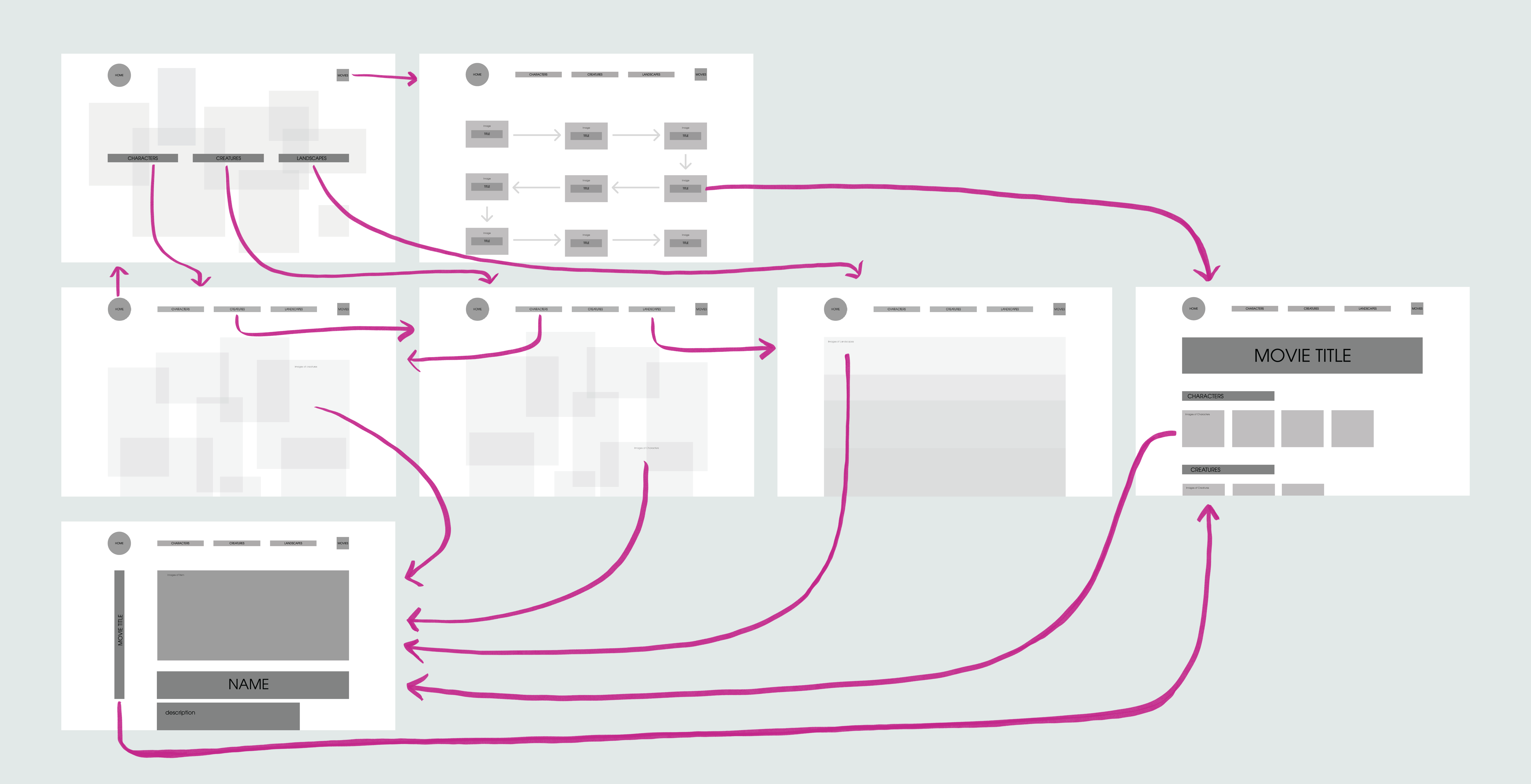
I focused on creating an intuitive experience for navigation from the home to the last internal page. This is mostly emphasized through the compositions. You can tell you are on an internal exploration page rather than an internal informational page through the consistent use of composition. Composition was important both for navigation but also because I wanted to capture the lively essence of Studio Ghibli. I explored different ideas of using the character, creature, and landscape elements and how the imagery could be displayed.
Once i decided on compositions, I created a lofi wireframe with a basic grid system so I could begin to develop a visual language. I slowly refined the layout and hot-spot transitions. We conducted user testing as well to enhance the iteration process.
Once i decided on compositions, I created a lofi wireframe with a basic grid system so I could begin to develop a visual language. I slowly refined the layout and hot-spot transitions. We conducted user testing as well to enhance the iteration process.


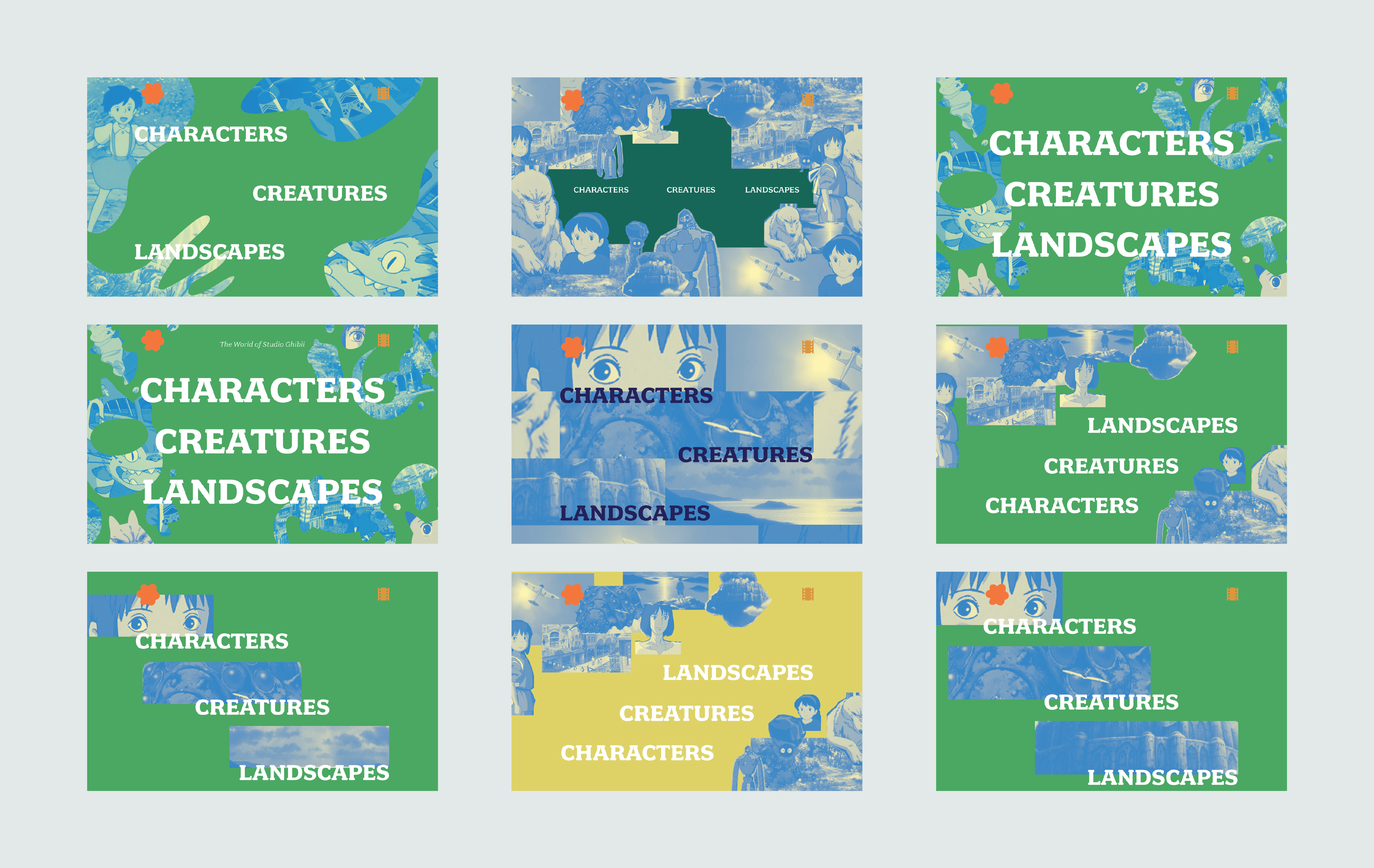
Using screencaps from the Ghibli movies was my main source of inspiration. I started with choosing colors from the landscapes and trying to understand the essence of what connected these images and styles together.
While exploring typefaces, I explicitly used the Ghibli logo sans serif fonts while also playing around with similar fonts. Part of what makes Ghibli movies feel so specific is the atmosphere of the movies. They feel soft, the designs are very unique, and are almost all animated in a traditional way. This felt on par with the qualities of a serif font, so I also explored, more distinct serif fonts as well.
Similarly, I wanted to translate the feeling of Ghibli movies to my website. I explored simple, bright, and playful design styles.