Interning at a startup allowed me to gain experience doing a wide range of work. I designed brand systems for a series of cloneable apps, developed fully functional cloneable app templates, and collaborated with the design team to create and strategize social media content. In addition, I had the opportunity to participate in the company's growth, providing feedback at meetings, developing content for new projects, and helping to debug issues within the program.
Adalo’s brand guideline emphasizes having an enthusiastic, supportive, and optimistic tone while also still communicating in a quirky and fun way. The focus was to make Adalo feel accessible and fresh. They use lots of simple shapes, bright colors, and of course their signature sparkles.
Adalo’s brand guideline emphasizes having an enthusiastic, supportive, and optimistic tone while also still communicating in a quirky and fun way. The focus was to make Adalo feel accessible and fresh. They use lots of simple shapes, bright colors, and of course their signature sparkles.


My first major project was to use Adalo’s no-code program to create an app template, also known as a “cloneable”, that users could “clone” and use for their own businesses. I designed the Nailed It! cloneable an app that allows business owners to have a double-sided interaction. On one end, clients could log in to access services and book appointments. On the other end, nail technicians could log in to accept appointments and change or add new services for their clients. This would allow many different Adalo users dealing with appointment-based services to repurpose the functionality for their own businesses.
You can explore the published cloneable here ︎.
You can explore the published cloneable here ︎.
For this brand, I explored a few different styles but chose this aesthetic because it felt the most applicable for the audience and this type of business. This was both playful but still refined. My intention was to appeal more to a young professional feminine audience. Adalo uses typefaces are from Google’s free database, so within that constraint I still wanted to find something sophisticated and modern.

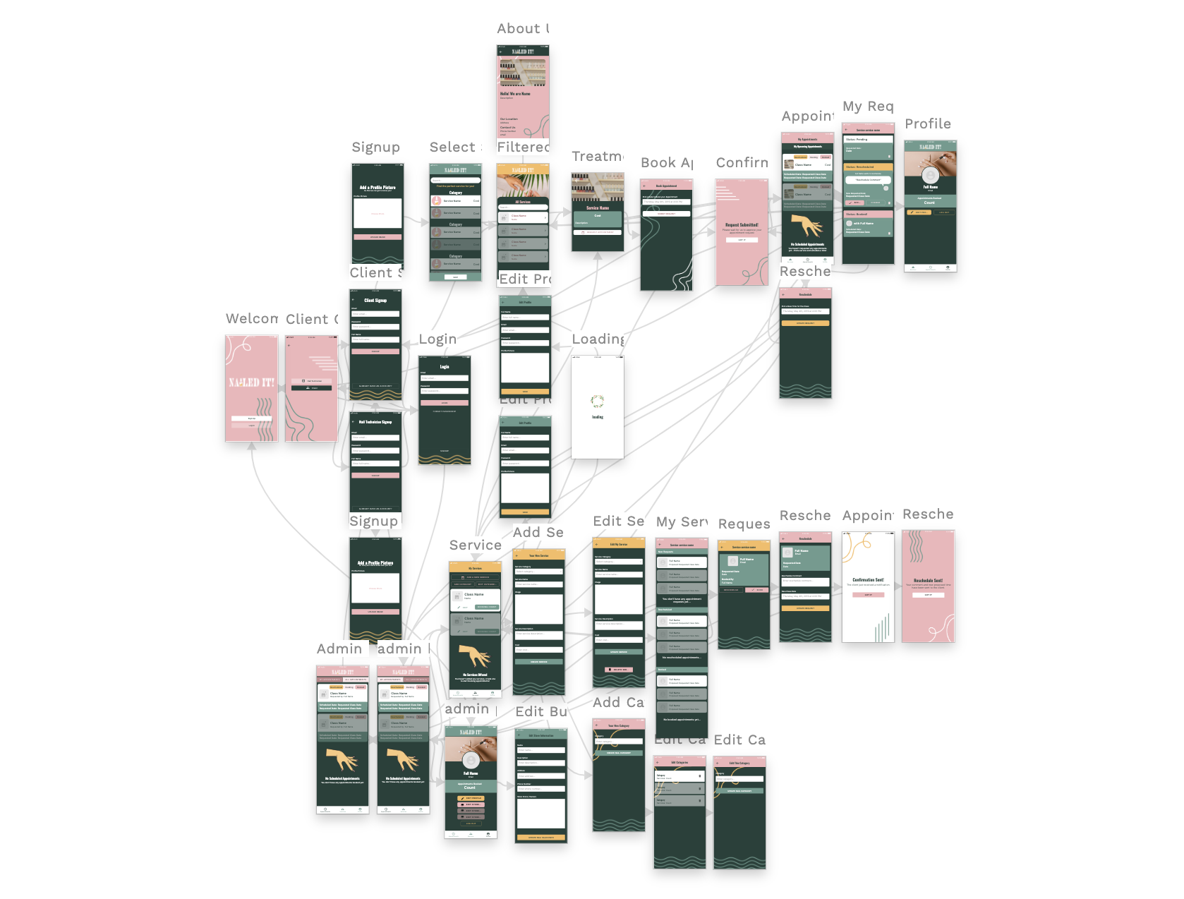
Part of the expectations for this project was to create a fully functioning app. This included designing the content architecture as well as the database system. However, being a no-code platform, I didn’t have to touch any code. I focused first on creating an intuitive interface and information architecture, then moved on to debugging smaller details like lists and buttons that were not working correctly. Debugging took surprisingly long, and required many meetings with CX teammates, but we eventually were able to get the app to work as I intended.
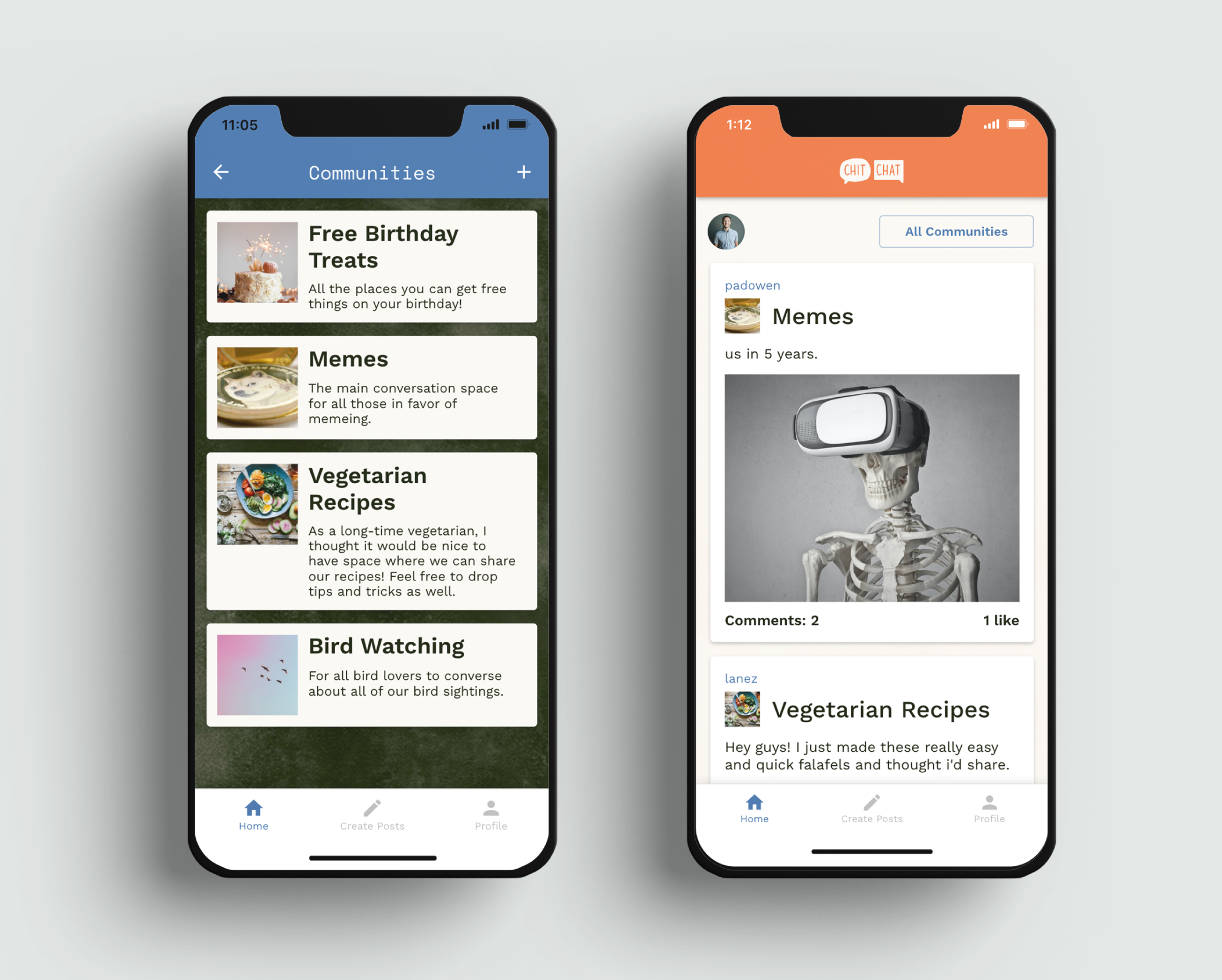
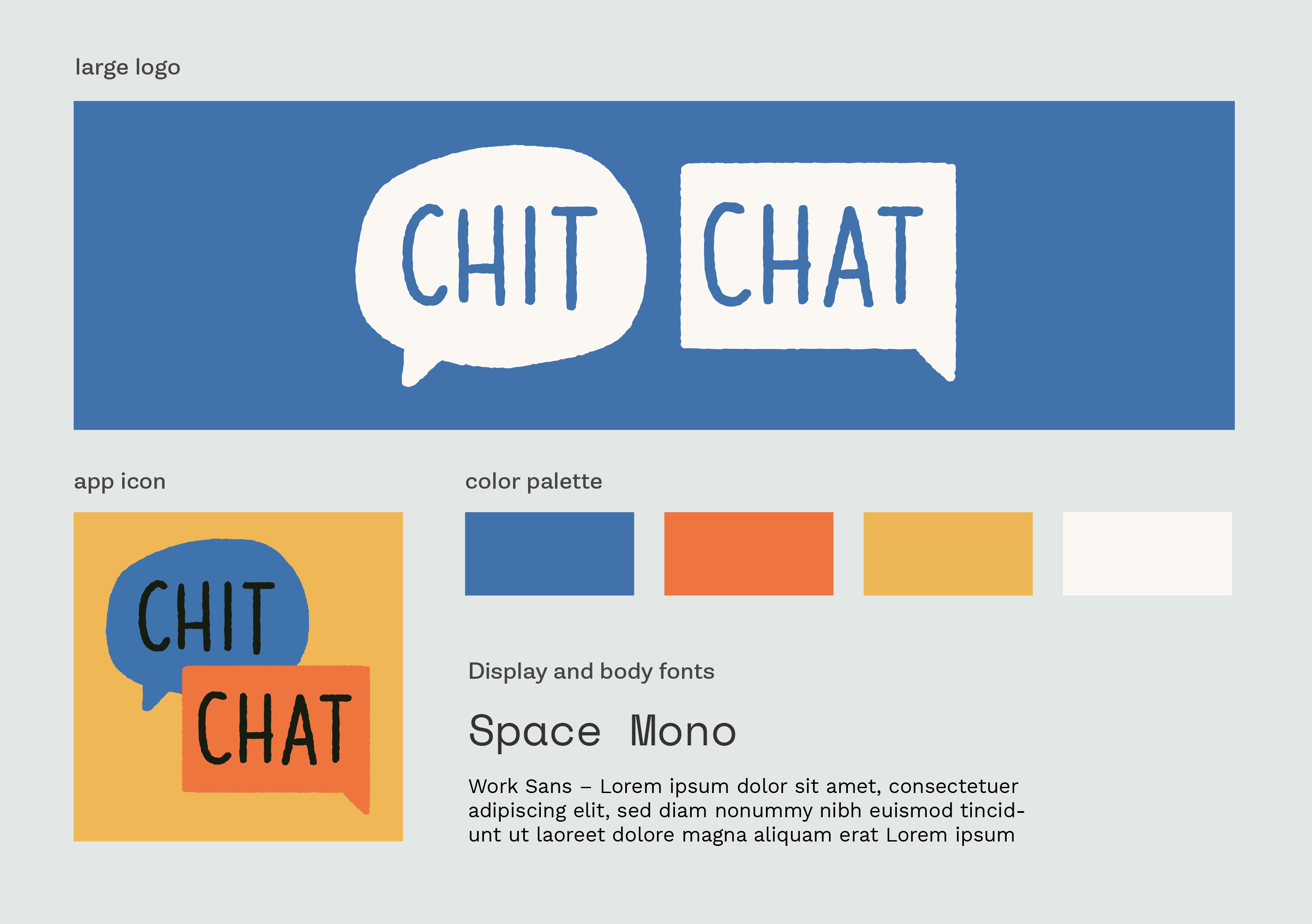
One of my later cloneable apps for Adalo was the Chitchat app, which provided users with the basic functionalities that Reddit has (posting, following, upvoting, etc). Similar to the Nailed It! project, I put together the user interface and content architecture. The purpose of this app was to show Adalo users that the platform is capable of replicating popular apps and their functionalities. For many users, it makes more sense to use a cloneable as their base to then apply their own businesses and ideas than to create a new app from scratch.
The Chitchat brand focuses on the collaborative nature of Reddit. The design language is more illustrative than Reddit’s brand, and I created “doodads” (as they call them at Adalo) that emphasize the conversive nature of Reddit’s functionality. Being a community based platform that appeals to all kinds of people, I chose a more gender neutral style and palette for the app.

For the architecture, I started with creating a basic wireframe, moved on to database design and functionality, and finished by implementing a design language and branding for the app. Although these steps feel very distinct, I often had to go back and forth as I discovered new bugs or better ways I could incorporate the user experience design with the visual design.

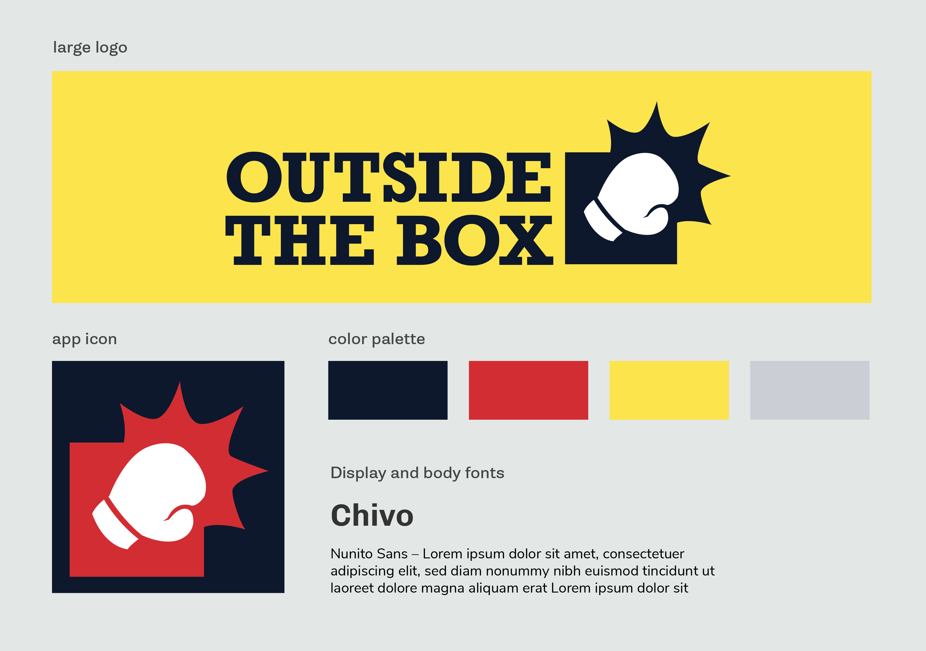
Outside the Box is branding for a fictional boxing gym. This was part of a company wide marketing campaign focusing on fitness templates for users. For this brand, Adalo’s UX designer created a series of fitness app templates, and interns were tasked with applying different brand systems to those templates. Our brands extended Adalo’s brand focuses, while still creating a new set of rules for colors, shapes, illustration style, and typography.
Outside the Box’s branding extends traditional boxing visual language. I was heavily inspired by old school boxing match posters, while also incorporating a more modern twist to the logo. Since we were creating a range of brands for different types of fitness businesses, I focused on making this feel explicitly like a boxing brand, rather than something more quirky.

A significant portion of this project was illustrating new graphics for onboarding screens. This included making a unique illustration for 11 different screens. These illustrations were the main focus of giving each brand a unique experience.

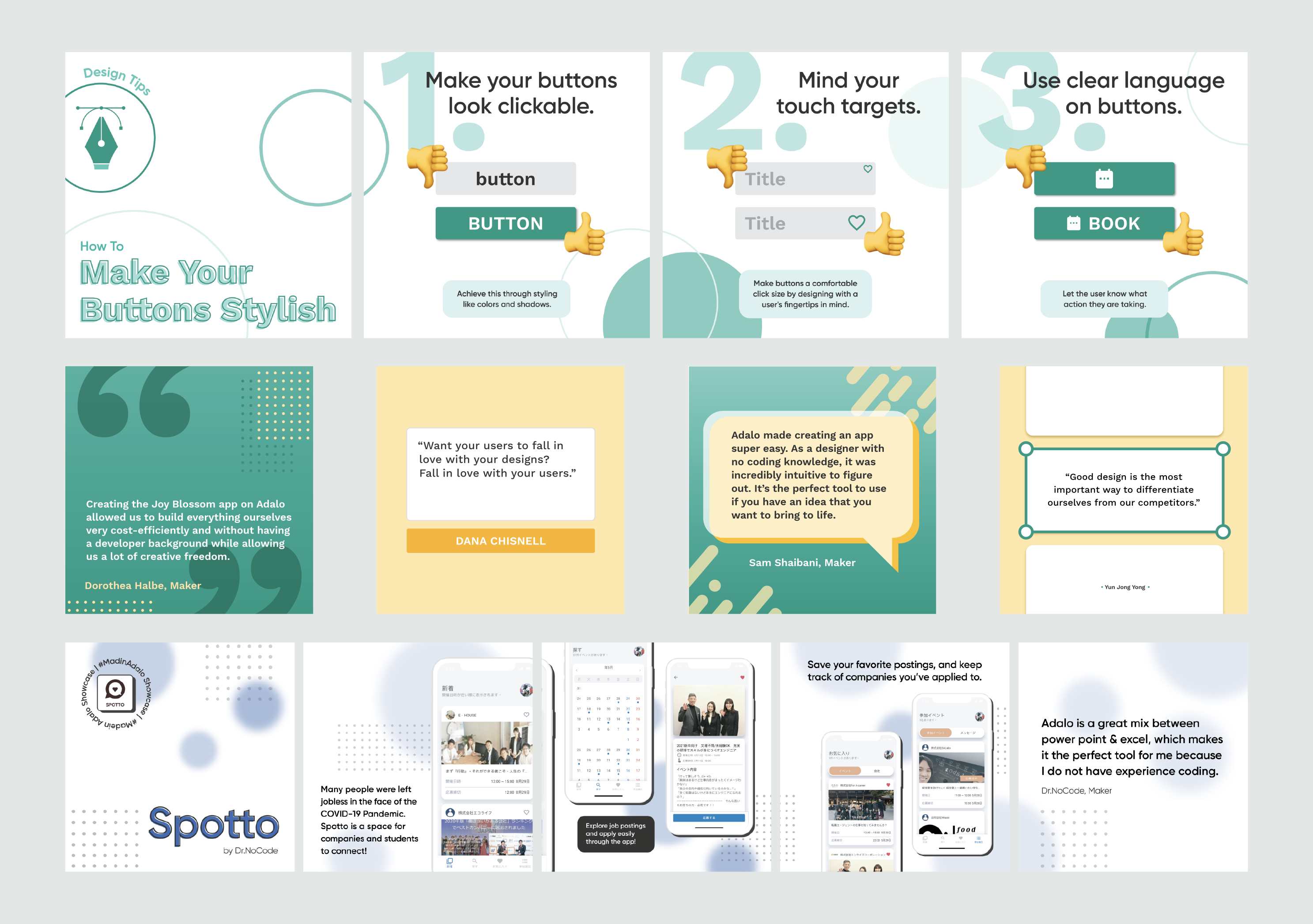
One of the goals of the internship was to strengthen Adalo’s online presence. As interns, we focused on applying the existing layouts and design language to create both an abundance and diversity of posts. We showcased work made by Adalo users, cloneable Adalo apps, design and user quotes, design tips, and Adalo blogposts. We created posts for all of Adalo’s social media, including LinkedIn, Twitter, and Instagram.
The other design intern and I put together new design languages for all design tips, blogpost, and quote posts. For these languages, we focused heavily on creating posts that would look balanced in their social media feed while also maintaining Adalo’s brand language clearly. We had much stricter guidelines for what colors to use, logo design, and “doodad” usage.