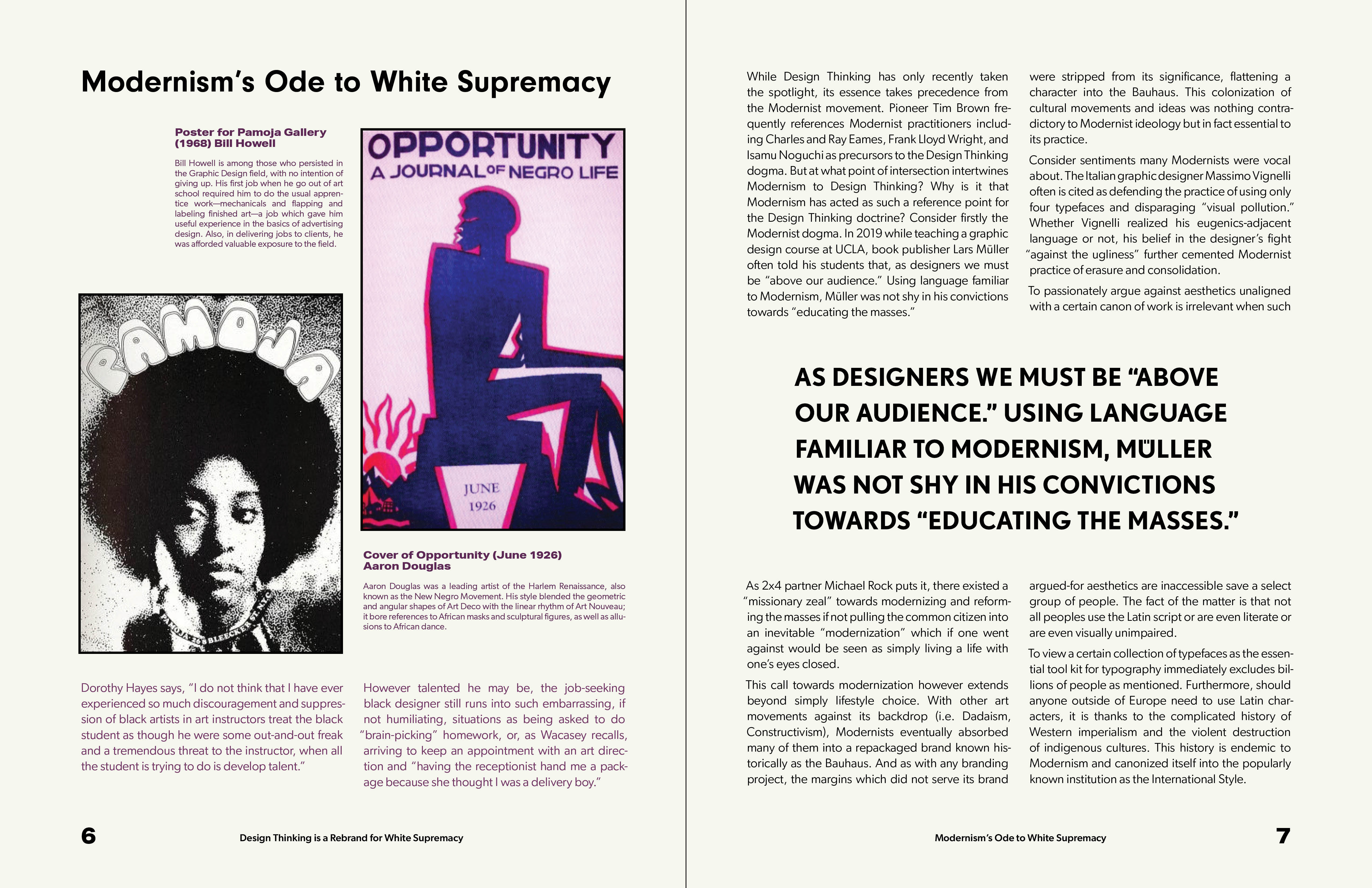
Typography ✶ Editorial Design ✶ Print
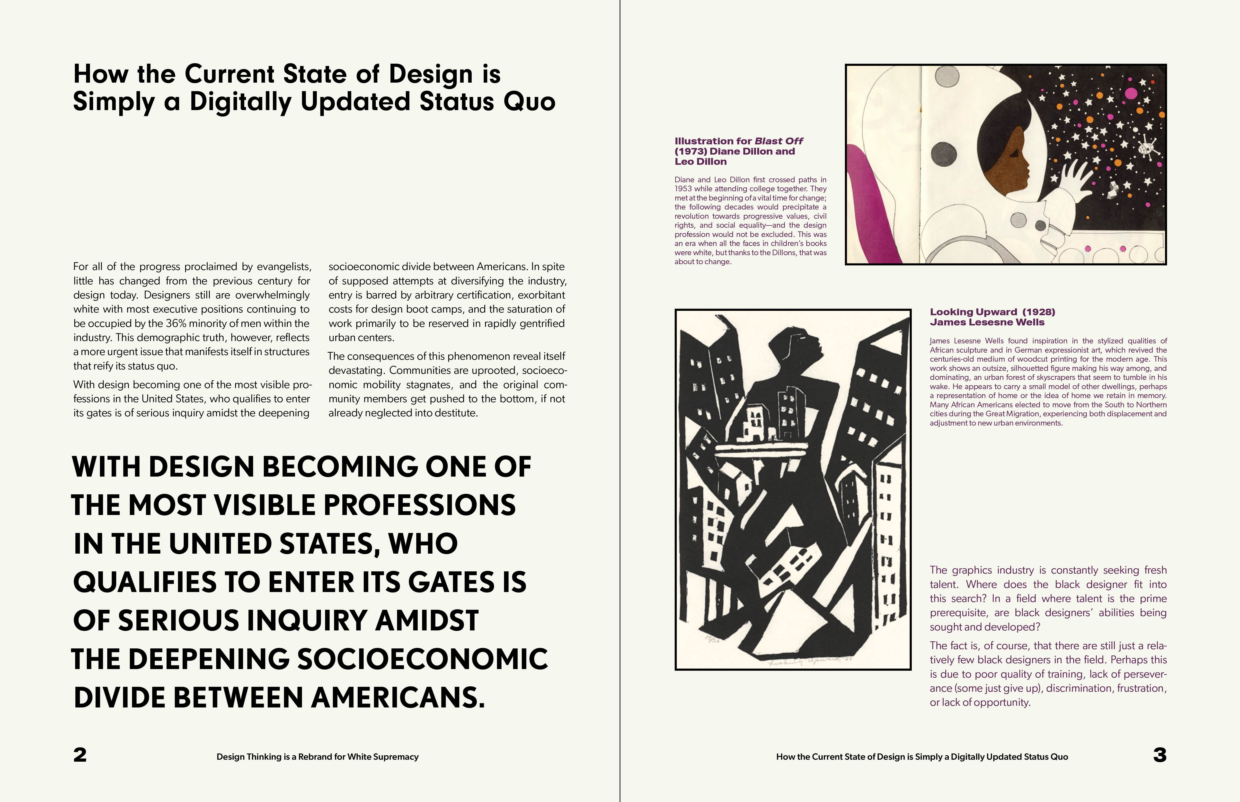
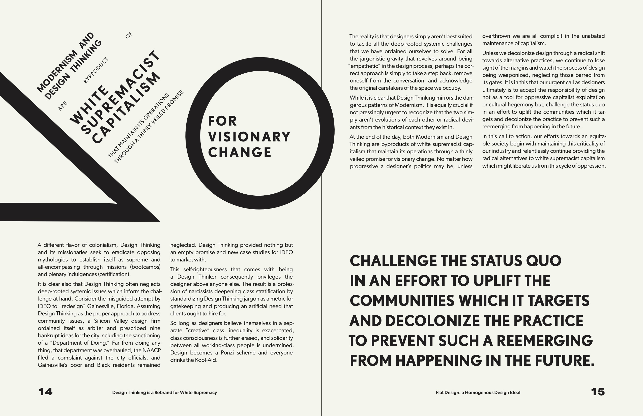
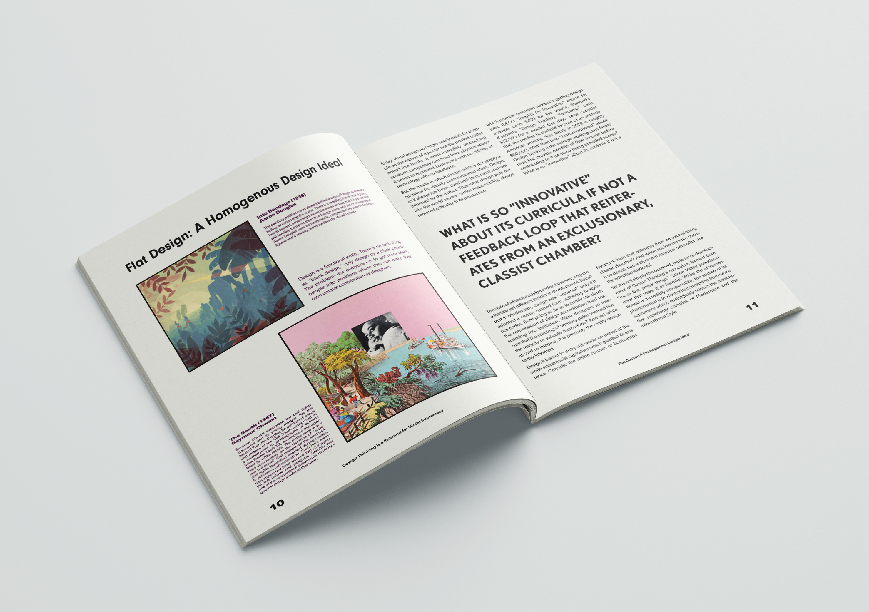
In this article published by Medium, Darin Buzon highlights the flaws within modern design, connecting the past ideologies of modernism with our present ideas around design thinking. My intention with this publication is to contrast the sleek, simple design of the Bauhaus against the content of the article and Black designers from the past. I chose to include excerpts from a secondary article, The Black Experience in Graphic Design: 1968-2020 by Dorothy Jackson to complement the imagery from black designers. This article provides first-person context on the impacts of having Eurocentric design standards. All of the content from Black designers is in color to create a metaphor for the binary views Modernism has towards design.
My goal with this publication was to highlight how Modernism erases all other design, especially that of designers of color, through its exclusionary definition of “good” design.
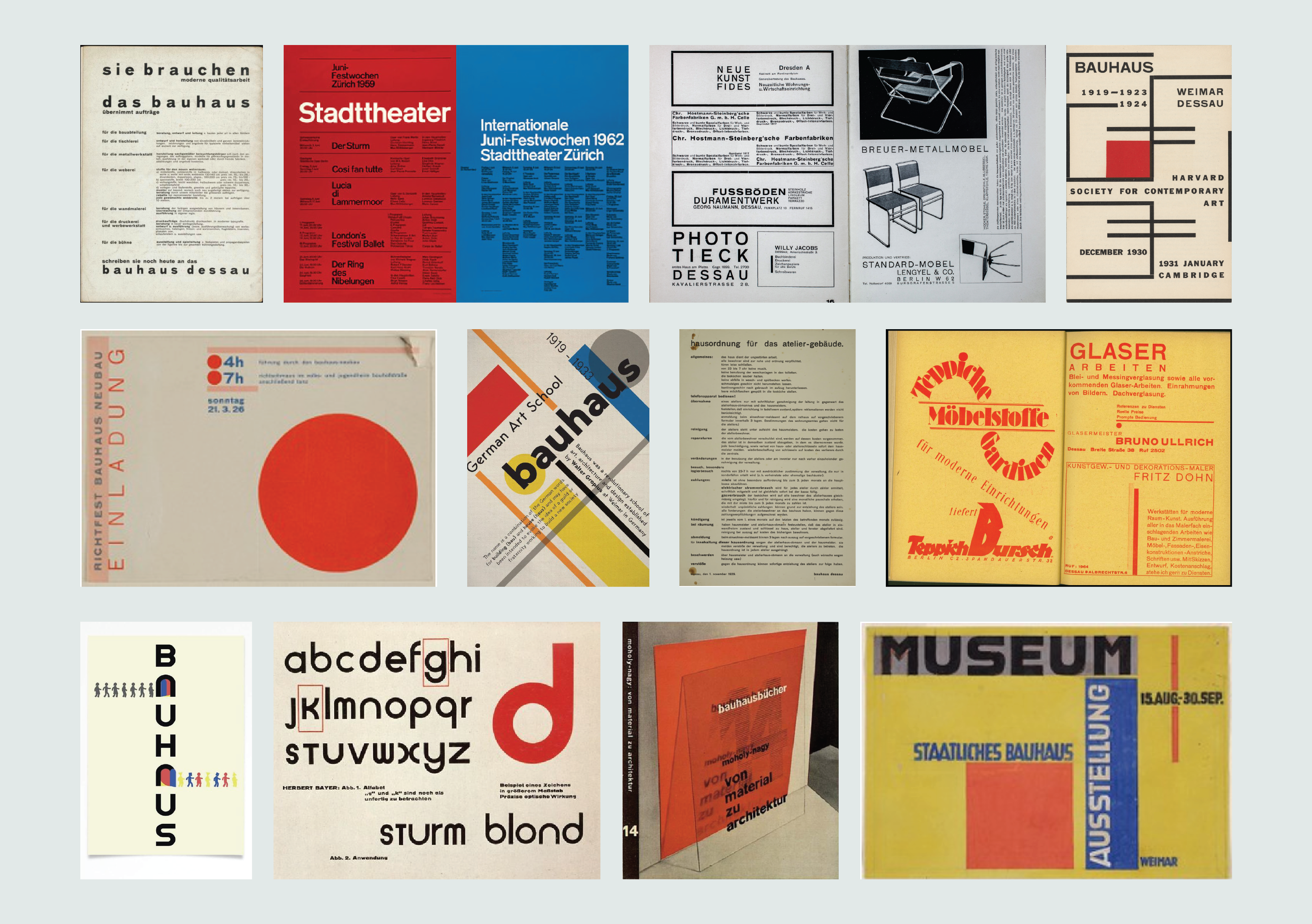
The Bauhaus clearly had an immense impact on modern design. Going into this project, I had the opportunity to dive into the history of the Bauhaus and focus on the aesthetic choices that define Bauhaus design. While doing research I focused on finding a wide range of Bauhaus typography so I could pinpoint the choices that define Bauhaus typography.
My intention was to contrast Modernist design with the article’s arguments against those specific values. I drew inspiration from a series of educational and advertising journals from the Bauhaus period. These journals were meant to spread Modernist design ideals such as “educating the masses”, therfore their form was a perfect contradiction to Buzon’s article. The dimensions of this publication were 8.5 x 11 inches to recreate the larger size of the Bauhaus journals. The journals were relatively simple publications and were mostly saddle stitched letter size.
My intention was to contrast Modernist design with the article’s arguments against those specific values. I drew inspiration from a series of educational and advertising journals from the Bauhaus period. These journals were meant to spread Modernist design ideals such as “educating the masses”, therfore their form was a perfect contradiction to Buzon’s article. The dimensions of this publication were 8.5 x 11 inches to recreate the larger size of the Bauhaus journals. The journals were relatively simple publications and were mostly saddle stitched letter size.
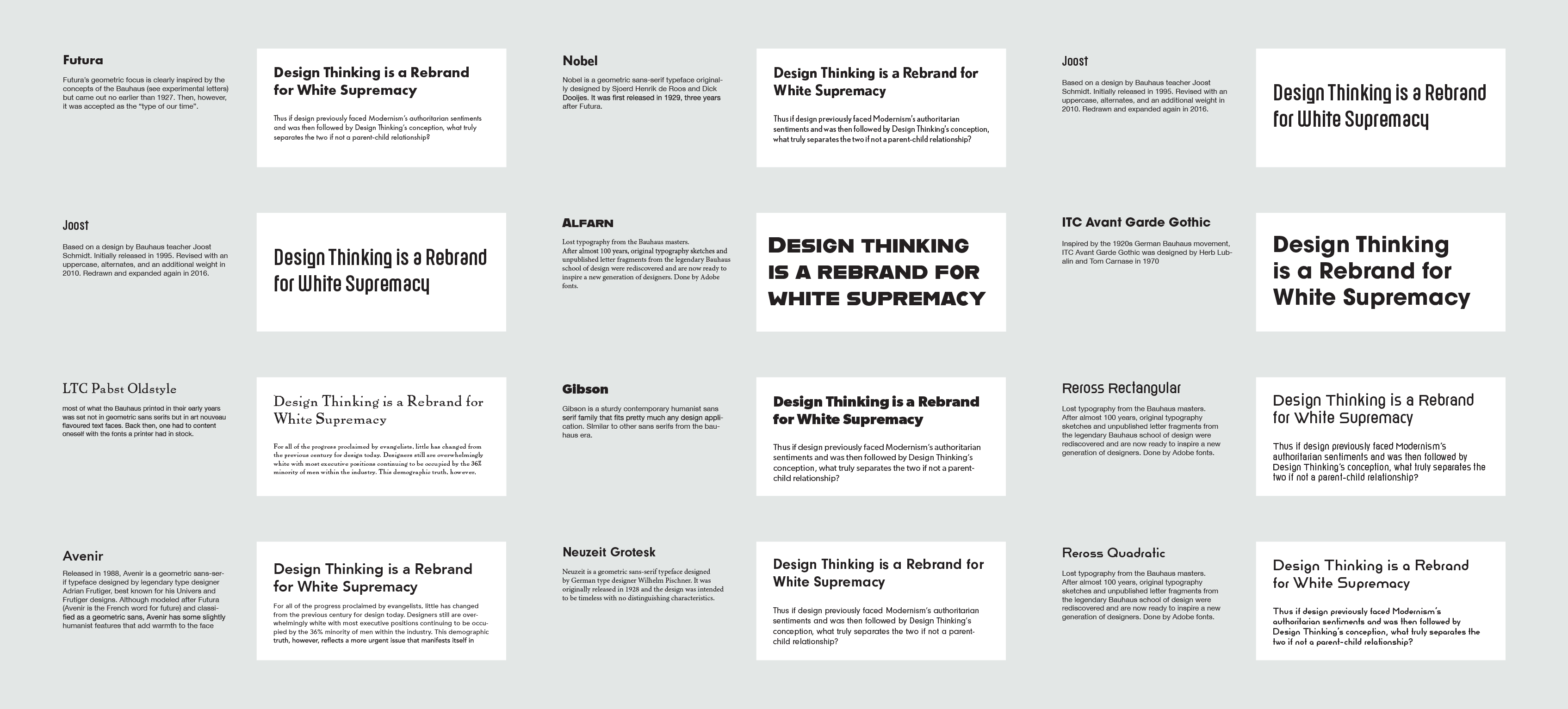
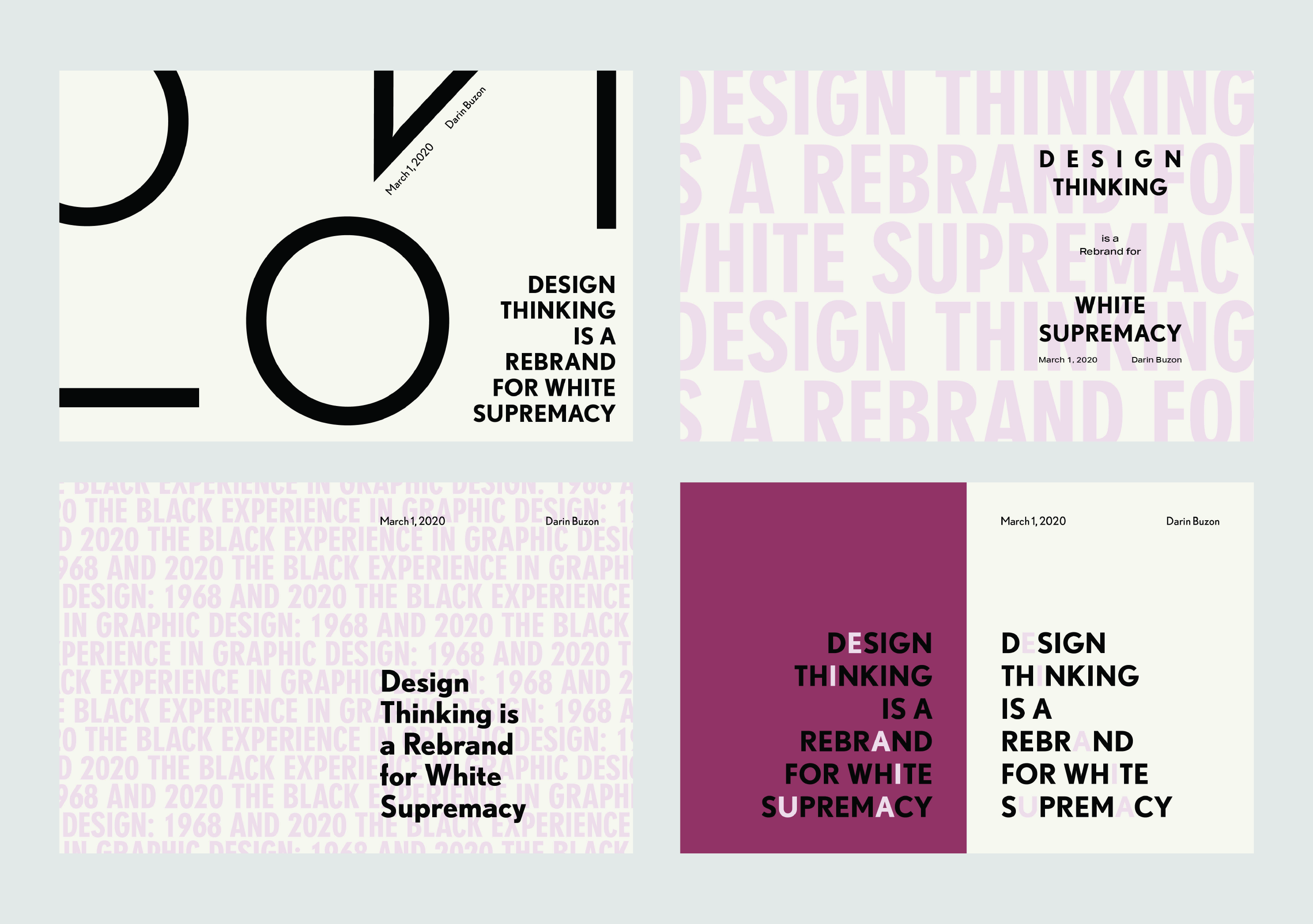
While researching, I collected typefaces that were explicitly designed to be Bauhaus as well as typefaces that felt inspired by the geometric style. My intention with four typefaces was to replicate and emphasize the more disjointed typographic style I found in many Bauhaus publications. Some publications used many different typefaces especially for expressive uses of typography.
Through explorations, I combined different typefaces, different weights, and different quantities of typefaces with each other. I also began to test different potential design directions and compositions with the different typefaces.
Through explorations, I combined different typefaces, different weights, and different quantities of typefaces with each other. I also began to test different potential design directions and compositions with the different typefaces.
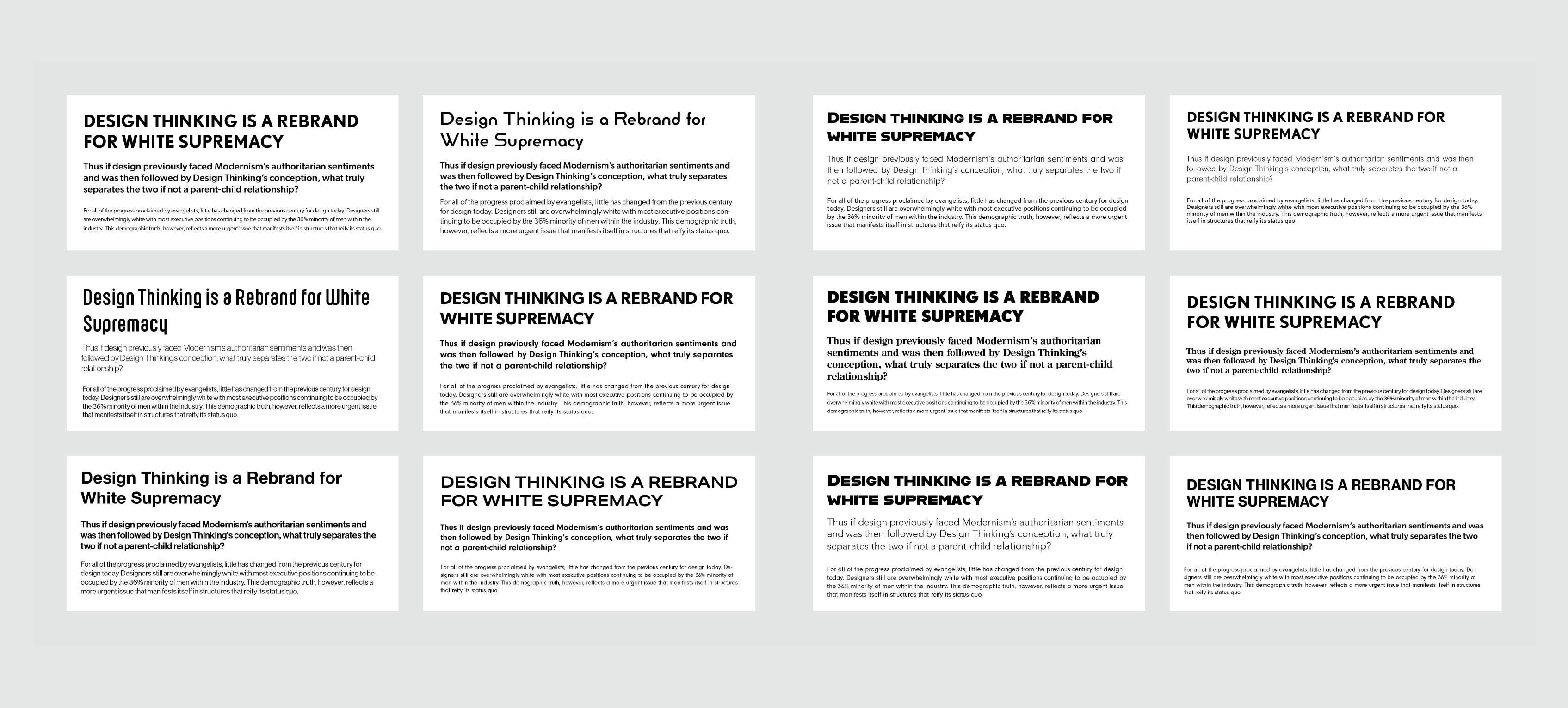
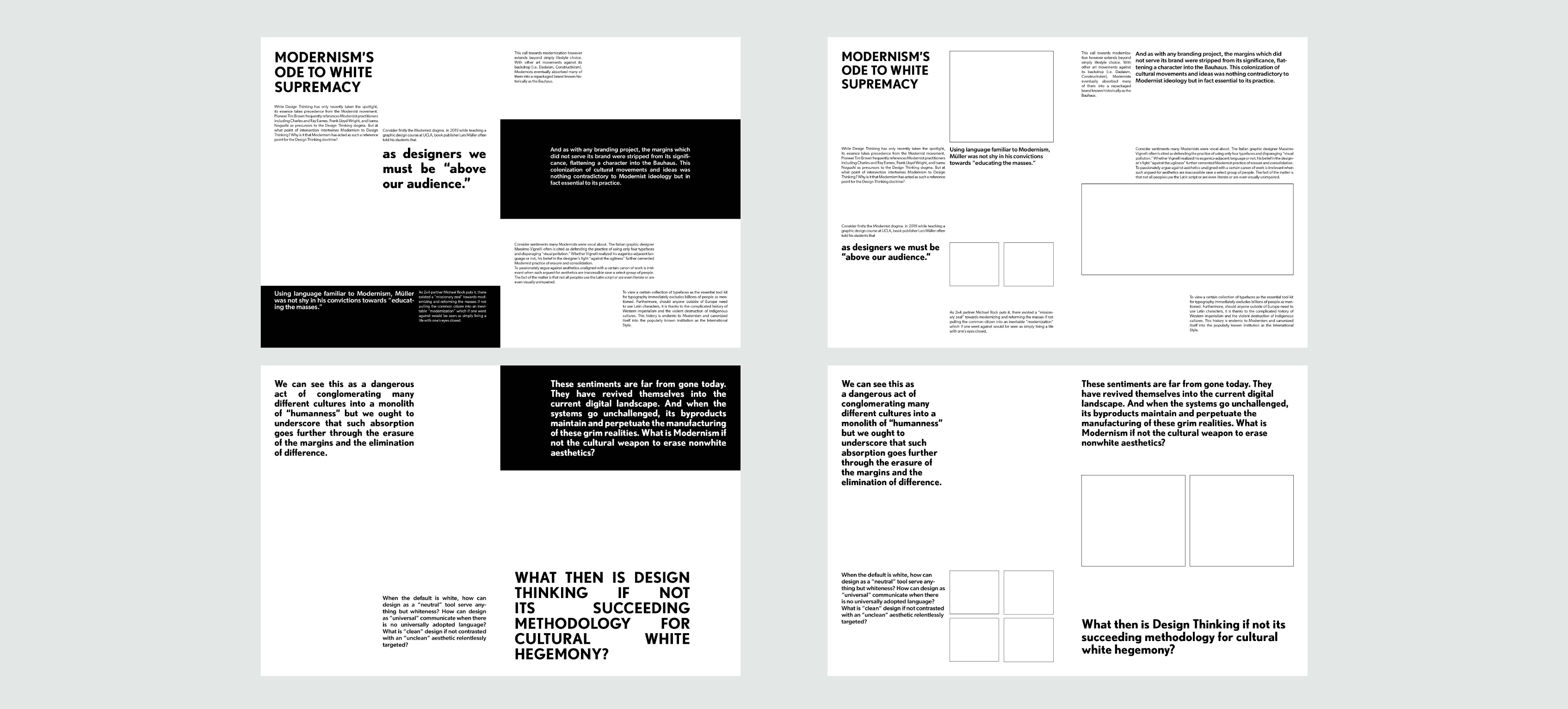
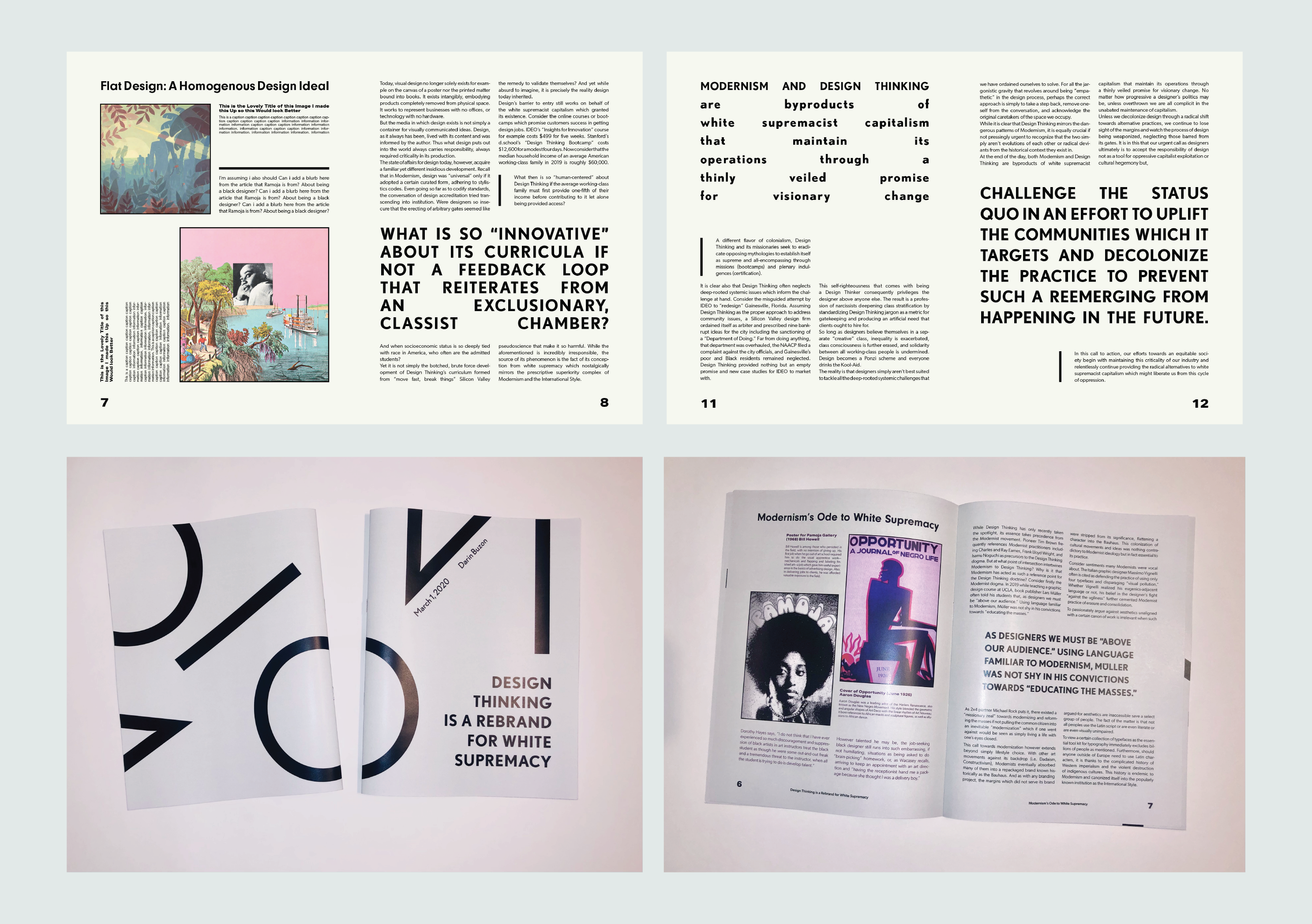
An important part of this project was taking the content of the article and pacing it well across the publication. I began by breaking the article down into sections, highlighting titles, pull-out quotes, and in-line quotes. I created a content map and played around with the content across spreads. I also explored different grid styles and directions with key spreads before finalizing my type choices and visual language.
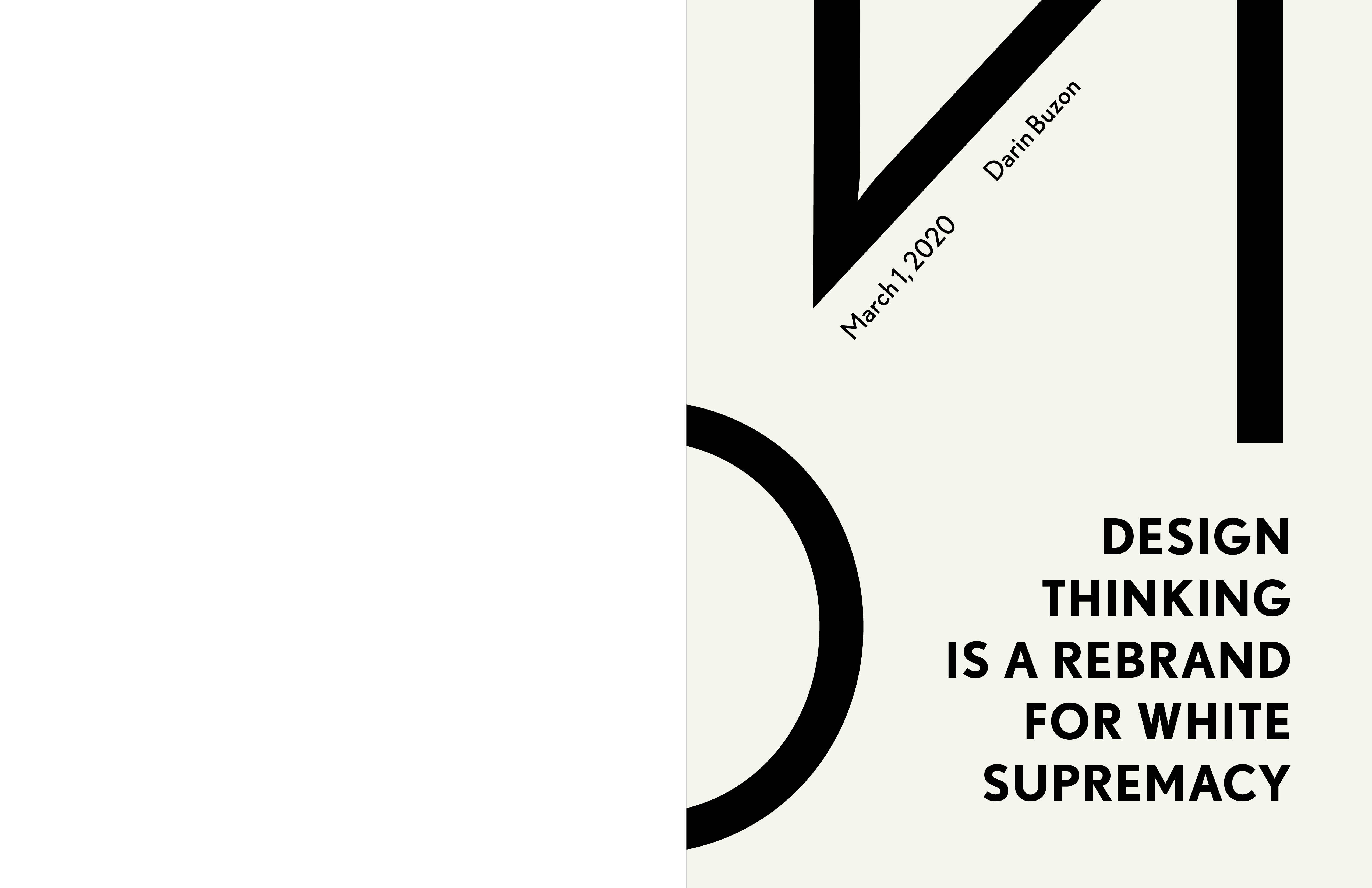
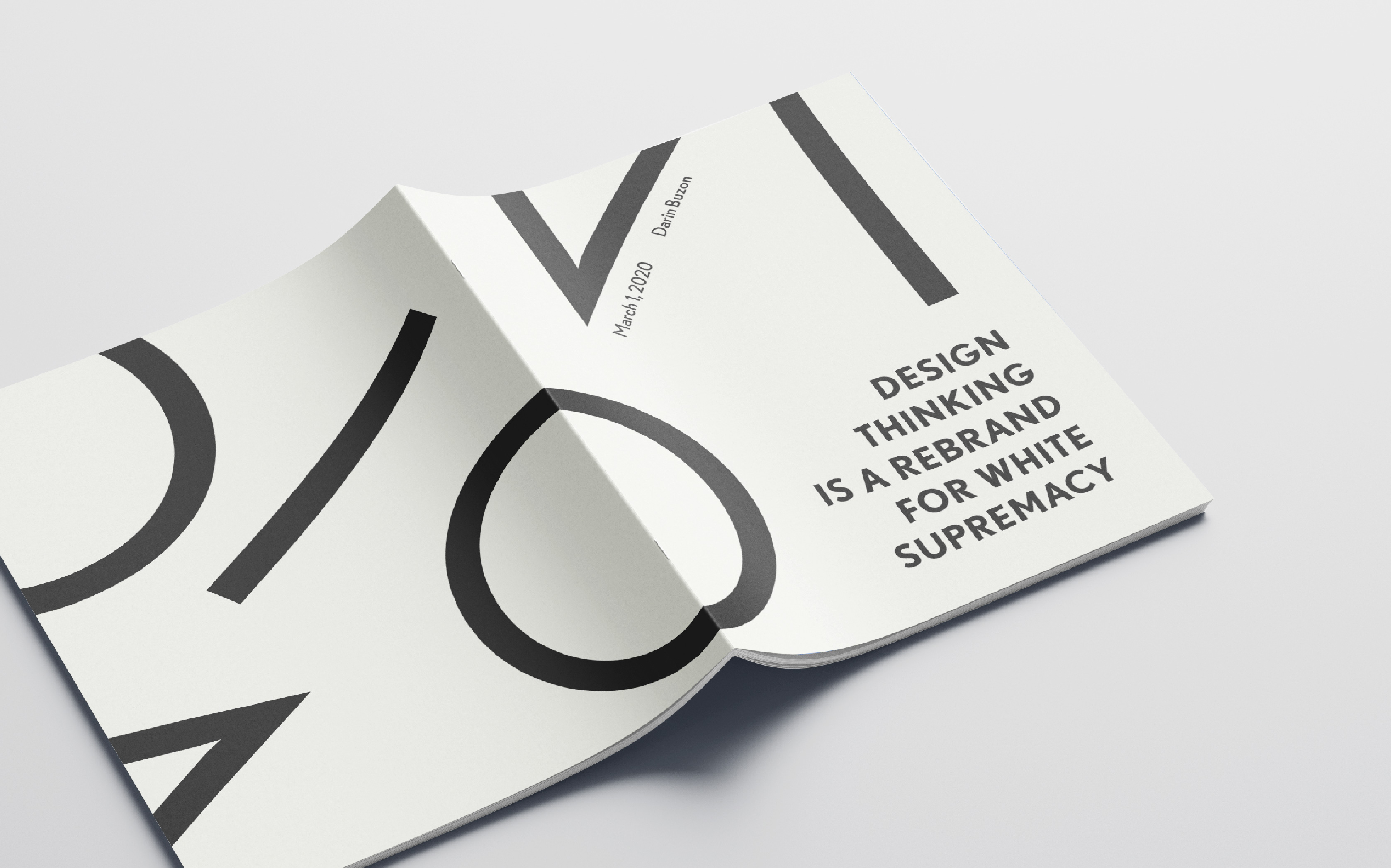
Having my design language and content pacing laid out, the next step was incorporating the two contrasting articles and content together. I was focused on perfecting the typography across my publication: making sure the justification was perfect, pull-out quotes had intentional spacing, and that I maintained a clear hierarchy especially contrasting Buzon's article with Jackson's article. With the cover, I explored the contrast between content and design again. The symbolism of the cover being the literal medium for hiding contents within led me to choose the most modernist cover for the final product.
Having my design language and content pacing laid out, the next step was incorporating the two contrasting articles and content together. I was focused on perfecting the typography across my publication: making sure the justification was perfect, pull-out quotes had intentional spacing, and that I maintained a clear hierarchy especially contrasting Buzon's article with Jackson's article. With the cover, I explored the contrast between content and design again. The symbolism of the cover being the literal medium for hiding contents within led me to choose the most modernist cover for the final product.